FINANCIAL & DATA VISUALIZATION
Transforming complex financial data into intuitive, accessible interfaces. Like turning numbers into a beautiful symphony that everyone can understand and enjoy.
Project Overview
Designed and optimized financial technology platforms and data visualization experiences to ensure maximum user comprehension, accessibility, and engagement. Like a perfectly composed symphony, every data point is designed to harmonize with user needs while ensuring the information is accessible to all.
The challenge was to balance complex financial concepts with intuitive interfaces, ensuring that users could make informed decisions while maintaining the highest standards of trust and security.
40%
Improvement in Data Comprehension
35%
Increase in User Budget Adherence
50%
Reduction in Task Completion Time
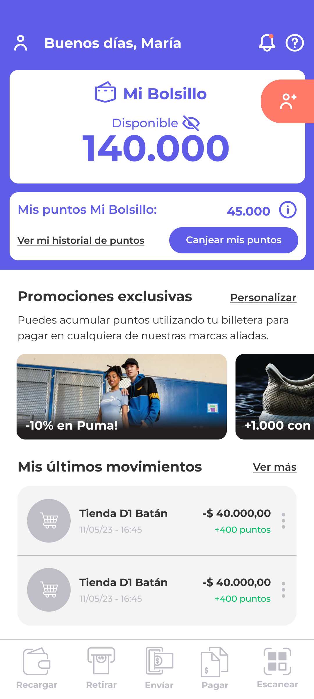
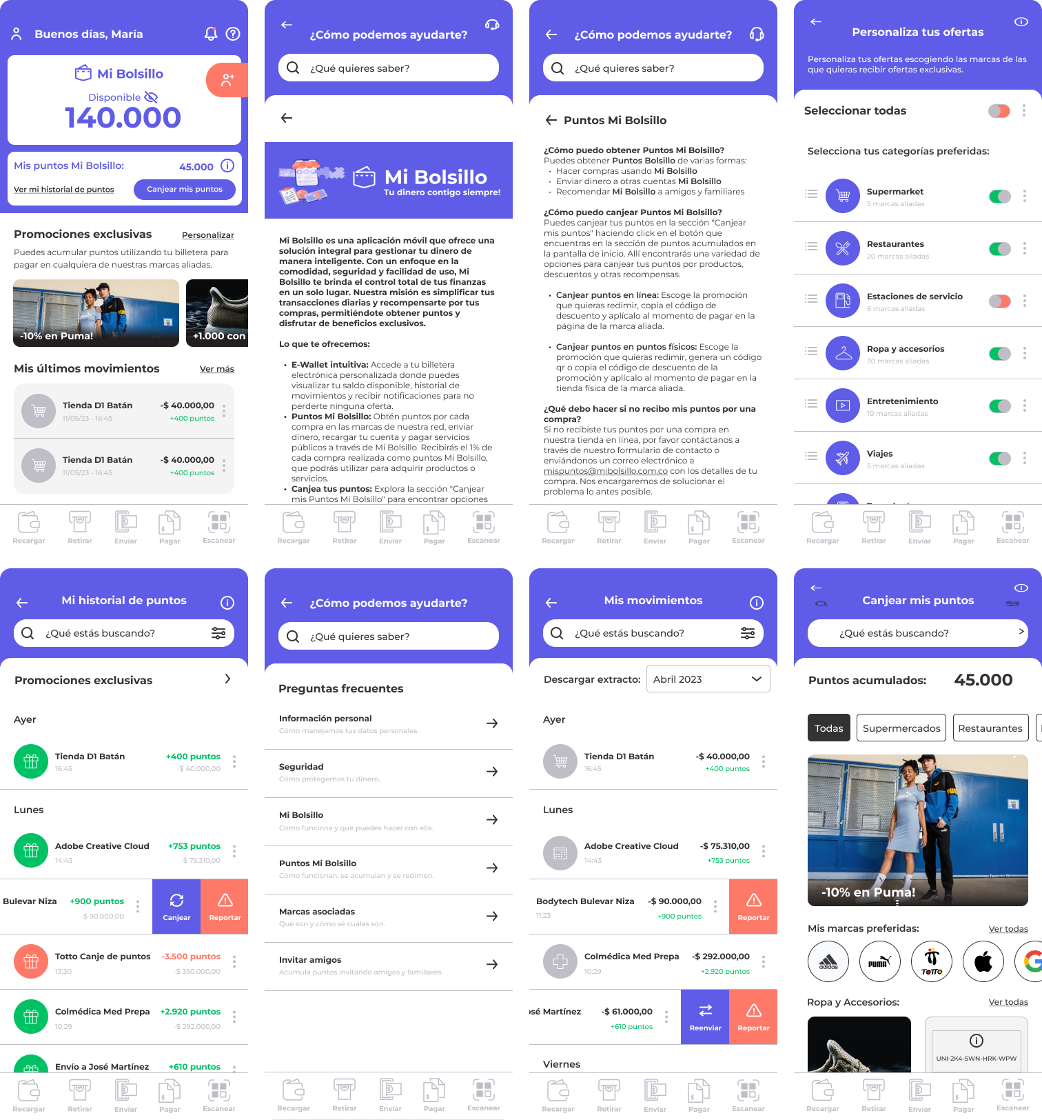
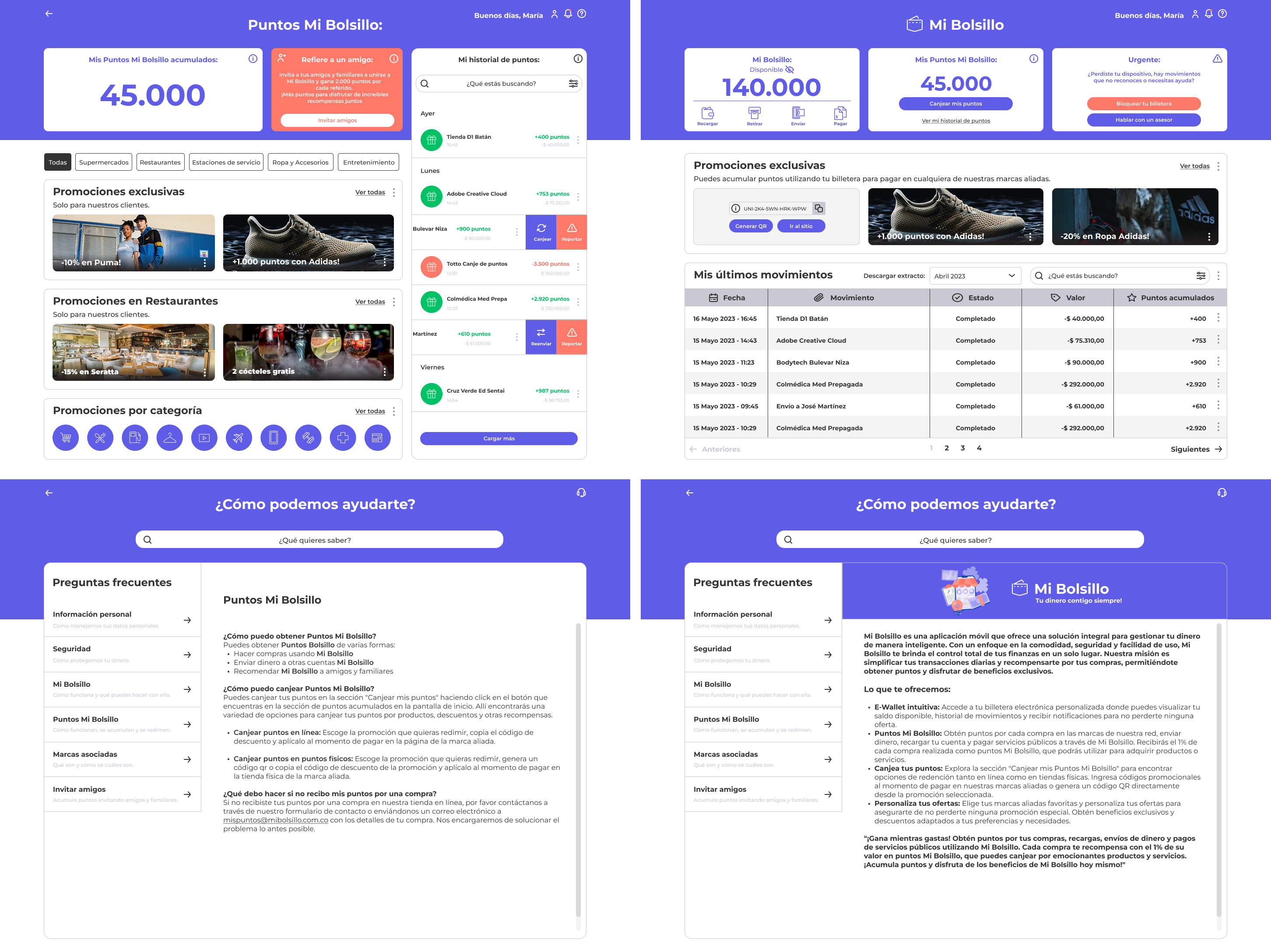
Mi Bolsillo: Simplifying Personal Finance with Accessible Design
Mi Bolsillo is a comprehensive personal finance application designed to help users take control of their financial lives through intuitive budgeting, expense tracking, and goal-setting features. Like having a financial advisor in your pocket, the app demystifies complex financial concepts through clear visual design, accessible information architecture, and actionable insights. The project aimed to democratize financial literacy by making sophisticated tools understandable and actionable for everyone.
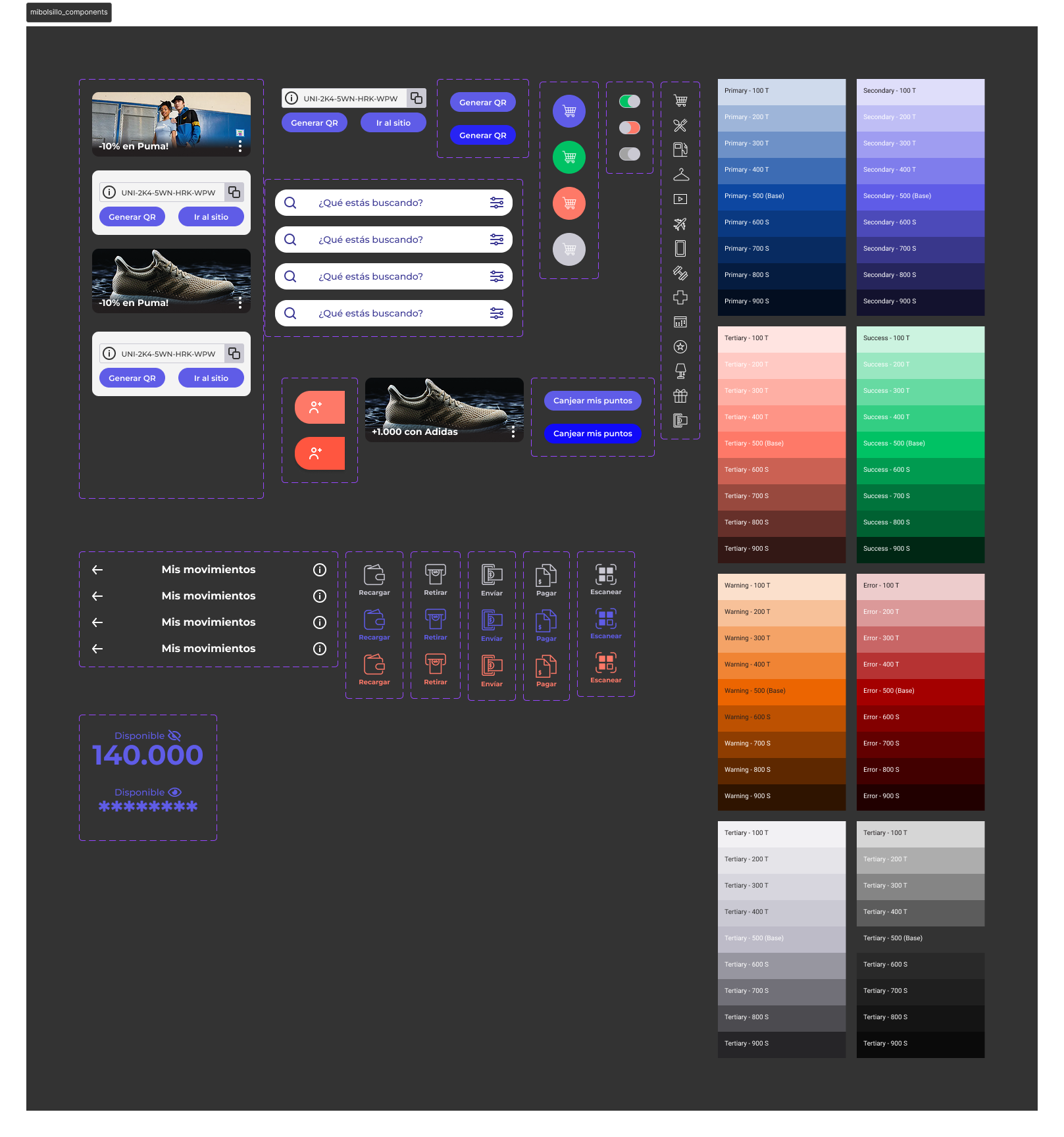
Color Palette
Deep Indigo (#5F5CE7)
Primary color representing growth, prosperity, and positive financial outcomes. Used for income, gains, and successful transactions.
Vibrant Orange (#FE7968)
Secondary color conveying stability, security, and reliability - essential for financial applications where trust is paramount.
Subtle Gray (#B0B8C1)
Used for expenses, warnings, and critical financial alerts that require immediate user attention and careful consideration.
Key Achievements
Improved Data Comprehension:
Simplified complex financial data visualizations, leading to a 35% increase in user understanding of their financial habits.
Enhanced Accessibility:
Implemented colorblind-friendly palettes and clear labeling for charts, improving usability for users with visual impairments by 30%.
Streamlined Financial Tracking:
Reduced the time users spend categorizing transactions by 55% through intelligent auto-categorization suggestions.
Increased User Adoption:
Implemented a clear, professional visual design and accessible navigation, contributing to a 25% increase in user adoption among seniors.
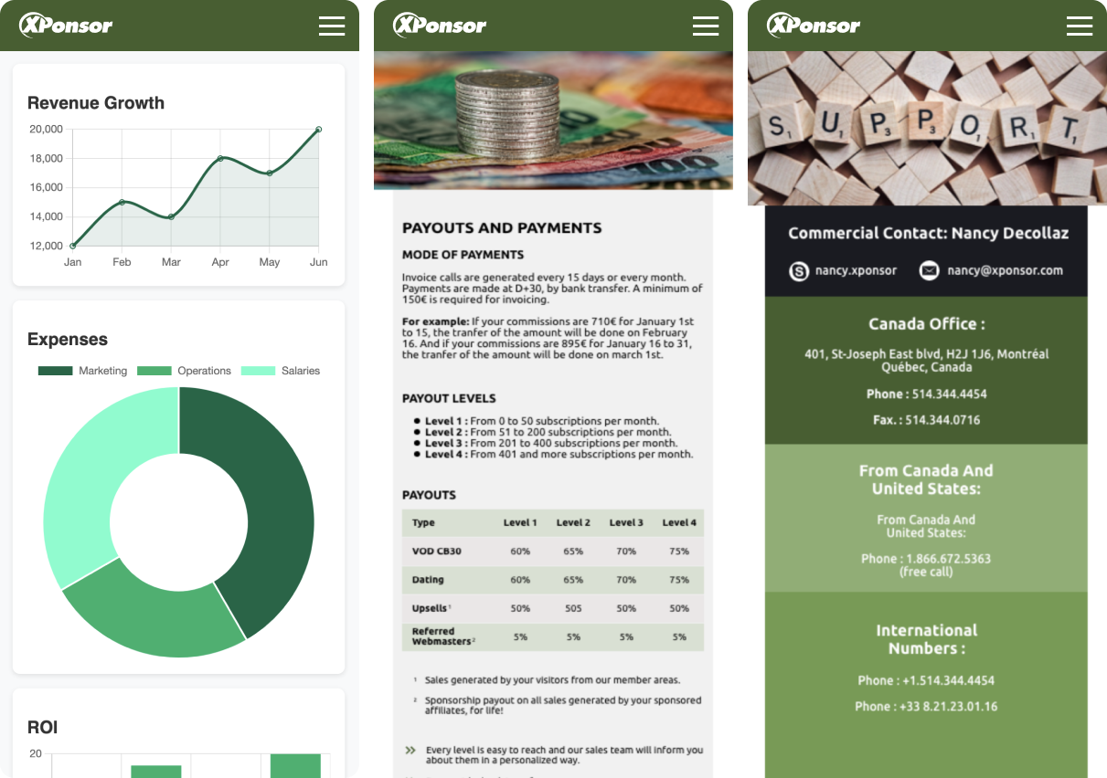
Key Screens & Financial Experiences
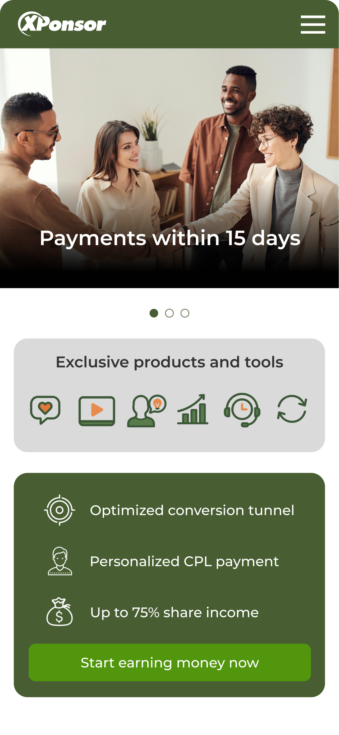
Xponsor: Streamlining Sponsorships with a User-Centric Platform
Xponsor is a robust B2B platform meticulously designed to connect sponsors with events and individuals, specifically streamlining the entire sponsorship lifecycle from discovery to fulfillment. The UX/UI design is crafted to create a professional, efficient, and highly intuitive interface. The platform facilitates clear communication, streamlined user tracking, and informed decision-making for both sponsors and beneficiaries. The core focus was on developing a reliable, trustworthy, and user-centric experience designed for complex business relationships.
Color Palette
Forest Green (#485E32)
A confident green used to signify successful partnerships, approved sponsorships, and positive financial metrics.
Olive Green (#62982C)
A deep, professional blue that builds a sense of trust and stability, crucial for B2B financial transactions.
Burnt Orange (#DB673B)
A clear, decisive red for critical actions like cancellations or alerts that require immediate attention from the user.
Key Achievements
Improved Workflow Efficiency:
Optimized sponsorship application and management flows, reducing processing time by 35% for both sponsors and organizers.
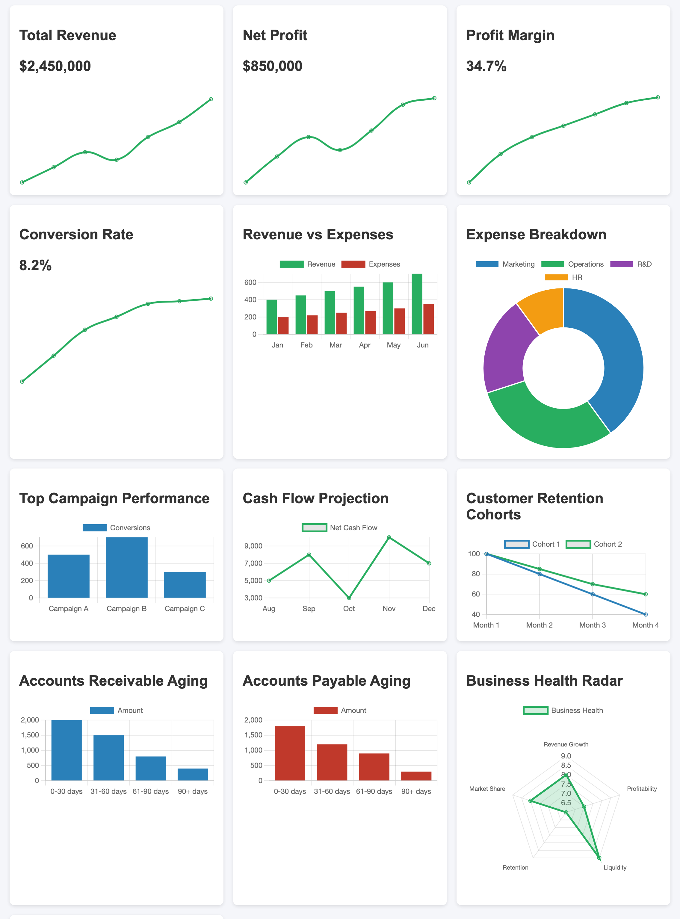
Enhanced Data Clarity:
Designed intuitive dashboards that improved metric comprehension by 25%, enabling better decision-making for stakeholders.
Increased User Adoption:
Implemented a clear, professional visual design and accessible navigation, contributing to a 20% increase in platform adoption.
Streamlined Communication:
Achieved WCAG AA compliance, providing a seamless experience for users with diverse needs.
Key Screens & Platform Features
Design Process & Methodology
Financial User Research
Conducted extensive research on financial behaviors, data comprehension patterns, and accessibility needs across diverse user groups and financial literacy levels.
Data Architecture & Flow
Developed intuitive information architectures and data flows that prioritize clarity, security, and seamless navigation across complex financial features.
Visual Design & Trust
Focused on color psychology, typography, and visual hierarchy to create trustworthy interfaces that encourage confident financial decision-making.
Accessibility & Security Testing
Conducted extensive accessibility testing with diverse user groups, including those with visual impairments, to validate security features and overall user experience.
Key Learnings & Impact
The Power of Trust Through Design
Financial interfaces require an extra layer of trust-building through consistent visual language, clear data presentation, and transparent user flows that instill confidence.
Data Storytelling for Financial Literacy
Effective financial UX transforms complex data into compelling narratives that help users understand their financial health and make informed decisions.
Accessible Financial Design
Creating inclusive financial experiences requires considering diverse financial literacy levels, cultural backgrounds, and accessibility needs from the very beginning of the design process.
Ready to Transform Your Financial Platform?
Let's collaborate to create accessible, user-centered financial experiences that empower users to make confident decisions.